
PeaceHealth
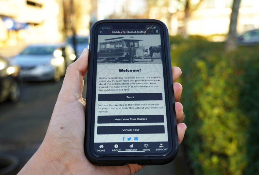
Strides for Social Justice (SFSJ) app
Strides for Social Justice is a free educational app developed by PeaceHealth in collaboration with the Eugene Marathon. Designed to be inclusive and family-friendly, the app provides an engaging experience that highlights the contributions, achievements, and milestones of Black residents in Lane County. Proceeds from the app directly support the Eugene/Springfield NAACP, combining education with meaningful social impact.
Our goal was to create a landing page to promote the app
The goal was to develop a promotional website for the Strides for Social Justice (SFSJ) app in time for Black History Month, aiming for launch before the end of February. The website was designed to raise awareness of the app’s educational mission and social impact, while driving engagement and encouraging downloads.
Navigating Multiple Stakeholders & a Tight Timeline
The primary challenge was developing the promotional website within a tight timeline, using PeaceHealth’s content management system (CMS), Drupal. Additional difficulties included the absence of a formal design process, limited resources, and a lack of a clearly defined decision-maker, which led to unclear priorities and slower decision-making.
These constraints impacted both the project’s execution and the end-user experience. Limited research hindered our ability to fully understand user needs, while the lack of streamlined processes created bottlenecks that affected the efficiency of our workflow.
Gathering insights & understanding the user’s needs
As the designer for the promotional website, my first step was to align with the business objectives of the various stakeholders involved. This included PeaceHealth (PH), Eugene Marathon (EM), and a 16-person committee made up of local officials, community members, and the NAACP.
Once I aligned with the overarching business objectives, I shifted my focus to understanding the end-user. Given the time constraints, limited resources, and the lack of a formal design process, I took a proactive approach by reviewing similar apps and promotional websites. This allowed me to gather valuable insights and identify key design trends that would resonate with our target audience.
A few key trends I observed from these sources include:
Easy App Download: Ensuring the download process was simple and prominently featured.
Clear Descriptions: Offering concise, easy-to-understand copy that explains the app’s features and benefits.
App Screenshots: Including visuals of the app interface to give users a preview of the experience.
Email Sign-Up: Featuring an email sign-up form for updates and related content, fostering engagement.
Accessibility Challenges: Noticing that some apps struggled with providing an inclusive experience for users unable to physically visit the locations highlighted in the app, which is an important consideration for our design.
Design Strategy & Constraints
Before beginning the design process, I carefully reviewed the website copy provided by the Eugene Marathon (EM). I identified that the content was lengthy and lacked key information, which posed several challenges for the user experience. The concerns included potential loss of interest, difficulty understanding how to use the app, unclear messaging on what the app offered, and trouble navigating the site. These issues could hinder the effectiveness of the site in both promoting the app and educating users.


Given these concerns and the project’s constraints, I created two sets of 6-page wireframes. The first wireframe prioritized time and simplicity, focusing on functionality and content clarity to ensure a quick and effective user experience. The second wireframe emphasized visual design, improving hierarchy and flow to create a more engaging and intuitive interface. Both wireframe sets included suggestions for content revisions, clear call-to-action (CTA) placements, and imagery options to enhance the overall user journey.
To create better hierarchy and flow in the second design option, I incorporated several key elements to enhance the user experience. I used imagery to break up dense content and added concise descriptions to long bulleted lists with links for better clarity. Additionally, I visually separated the contact section by user type, making it easier for visitors to find relevant information. For example, tech support inquiries for the SFSJ app were grouped separately from donation-related questions, ensuring users could quickly navigate to the information they needed.
Building on the insights gathered from similar promotional sites, I introduced the following elements:
Descriptive Intro in the Hero Section: To immediately engage users with the purpose of the app.
Jump Link to Download Section: To allow users to quickly access the app download link, improving usability.
“Why” Section Below the Hero: To communicate the mission and value of the SFSJ app, helping users connect with its purpose.
Graphic Elements & Descriptions: To visually demonstrate how to download and use the app.
Live Screenshots & Branding: To give users a preview of the app interface and enhance trust.
Email Signup Form: To capture user interest and provide updates on promotional opportunities.
These adjustments not only improved the visual flow but also ensured the website was informative, easy to navigate, and aligned with the app’s goals.

Consolidating to a One-Page Site to Save Time
When reviewing the initial 6-page wireframes with the development team at PeaceHealth, it became clear that building a multi-page site within the tight February deadline would be challenging. To address this, we made the decision to consolidate the site into a single-page layout, streamlining development and simplifying the user journey.
The revised one-page wireframe prioritized key elements to ensure both clarity and functionality:
A descriptive intro to immediately capture user interest and explain the app’s purpose.
A prominent app download section for quick and easy access.
Mission and value statements to communicate the app’s goals and community impact clearly.
This streamlined approach allowed us to meet the deadline while still delivering a user-friendly and informative experience.

Navigating Stakeholder Alignment & Decision-Making
When presenting the revised one-page wireframe to PeaceHealth (PH), Eugene Marathon (EM), and the 16-person committee, reaching a unanimous decision proved difficult due to the lack of a clear decision-maker. This created delays in finalizing the design and, ultimately, led to the elimination of several sections, content, and imagery in order to meet the deadline.
While this decision allowed us to deliver the site on time, it resulted in a significant loss for the user experience, as we had to cut back on valuable content that could have enhanced engagement and education. The lack of clarity in decision-making highlighted the importance of a defined leadership structure to streamline the design process and ensure a more cohesive end product.

Successful Launch and Continued Impact
Both the Strides for Social Justice (SFSJ) app and promotional website launched on time and were successful in meeting their objectives. The app gained national attention and continues to be featured in the media, including being highlighted during the 2022 World Athletics Championships. PeaceHealth also continues to enhance the app by adding new routes, expanding its reach and impact.
Check out the live promo site at www.stridesforsocialjustice.org or download the app on the App Store or Google Play.
Duration
Jan 2021 - Feb 2021
My role
Lead Designer
Software & tools
Adobe CC
Drupal (CMS)